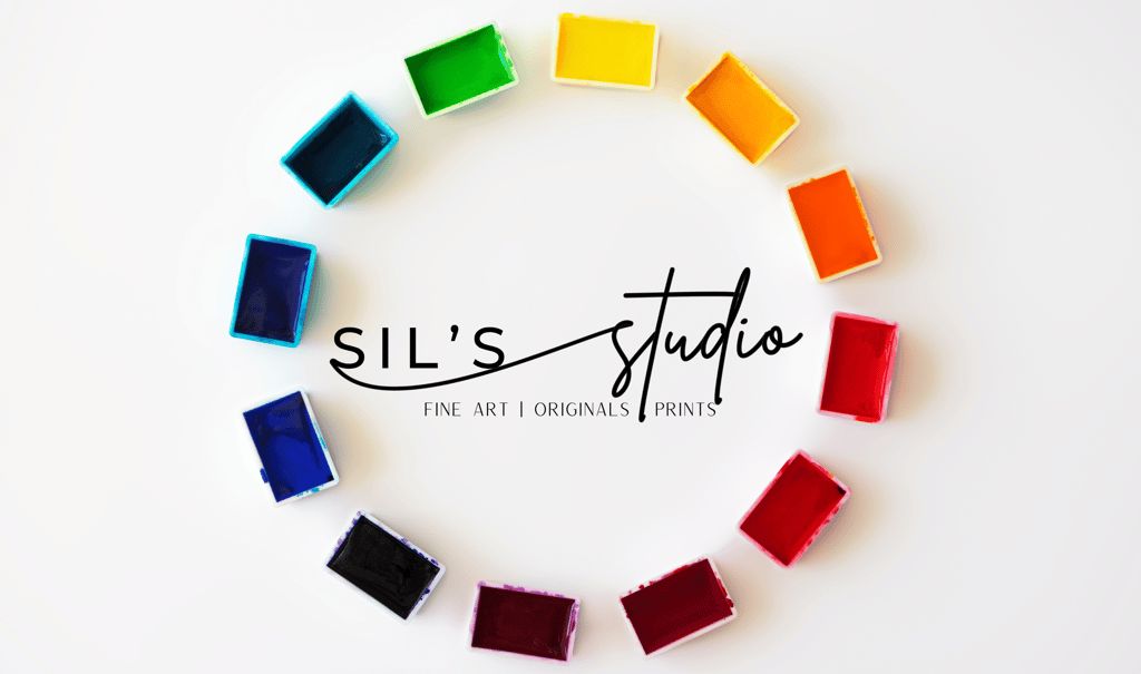
Color Wheel Basics
Frank Silvestré
12/8/20232 min read

Understanding the Color Wheel
Color is an essential tool that artists must master in order to create visually appealing and harmonious compositions. By understanding the color wheel and its various components, artists can effectively use color to convey emotions, create depth, and evoke specific moods in their artwork.
The Primary Colors
The color wheel is based on three primary colors: yellow, blue, and red. These colors cannot be created by mixing other colors together and are considered the building blocks of all other colors. They are vibrant and pure, and when combined in different ways, they create a wide range of hues.
The Secondary Colors
When two primary colors are mixed together, they create the secondary colors. The secondary colors are green (a mix of blue and yellow), orange (a mix of red and yellow), and violet (a mix of blue and red). These colors are located between the primary colors on the color wheel.
The Tertiary Colors
Further mixing the primary and secondary colors together creates the tertiary colors. These colors are Yellow-Green, Blue-Green, Blue-Violet, Red-Violet, Red-Orange, and Yellow-Orange. They sit between the primary and secondary colors on the color wheel, offering a wider range of shades and variations.
Understanding Warm and Cool Colors
Colors can also be categorized as warm or cool. Warm colors include red, oranges, and yellows, which evoke feelings of energy, passion, and warmth. These colors tend to advance and appear more dominant in a composition. On the other hand, cool colors include blues, greens, and violets, which create a sense of calmness, tranquility, and serenity. Cool colors tend to recede and appear more passive in a composition.
Using the Color Wheel in Art
The color wheel serves as a useful tool for artists when choosing color schemes and creating harmonious compositions. Here are a few ways artists can use the color wheel:
Complementary colors: Complementary colors are located opposite each other on the color wheel, such as red and green or blue and orange. Using complementary colors in a composition creates contrast and visual interest.
Analogous colors: Analogous colors are located next to each other on the color wheel, such as blue and green or red and orange. Using analogous colors in a composition creates harmony and a sense of unity.
Triadic colors: Triadic colors are evenly spaced on the color wheel, such as yellow, blue, and red. Using triadic colors in a composition creates a vibrant and balanced color scheme.
Artists can also experiment with different shades, tints, and tones of colors to create depth and add visual interest to their artwork. By understanding the color wheel and how colors interact with each other, artists can confidently use color to enhance their artistic expressions.
In Conclusion
The color wheel is a fundamental tool for artists to understand and utilize in their artwork. By familiarizing themselves with the primary, secondary, and tertiary colors, as well as warm and cool colors, artists can effectively create visually appealing compositions that evoke the desired emotions and moods. The color wheel serves as a guide for choosing color schemes and creating harmonious combinations that enhance the overall impact of the artwork.